Kenwood Persona: The Difference is Clear

Kenwood Persona
The Difference is Clear

The Brief

Finding creative ways to introduce a new homeware product is a challenge we relish, but it isn’t always easy when it’s being launched into a crowded market with many similar but cheaper alternatives already available. That being said, with Kenwood’s Glass range being the only matching glass set on the market, there was the benefit of having two unique, beautifully designed appliances for inspiration. The Well & Truly creative team were tasked with developing the story, strapline and positioning to support the launch of this matching kettle and toaster as new glass products within the Persona sub-brand.

Finding creative ways to introduce a new homeware product is a challenge we relish, but it isn’t always easy when it’s being launched into a crowded market with many similar but cheaper alternatives already available. That being said, with Kenwood’s Glass range being the only matching glass set on the market, there was the benefit of having two unique, beautifully designed appliances for inspiration. The Well & Truly creative team were tasked with developing the story, strapline and positioning to support the launch of this matching kettle and toaster as new glass products within the Persona sub-brand.

Our Solution

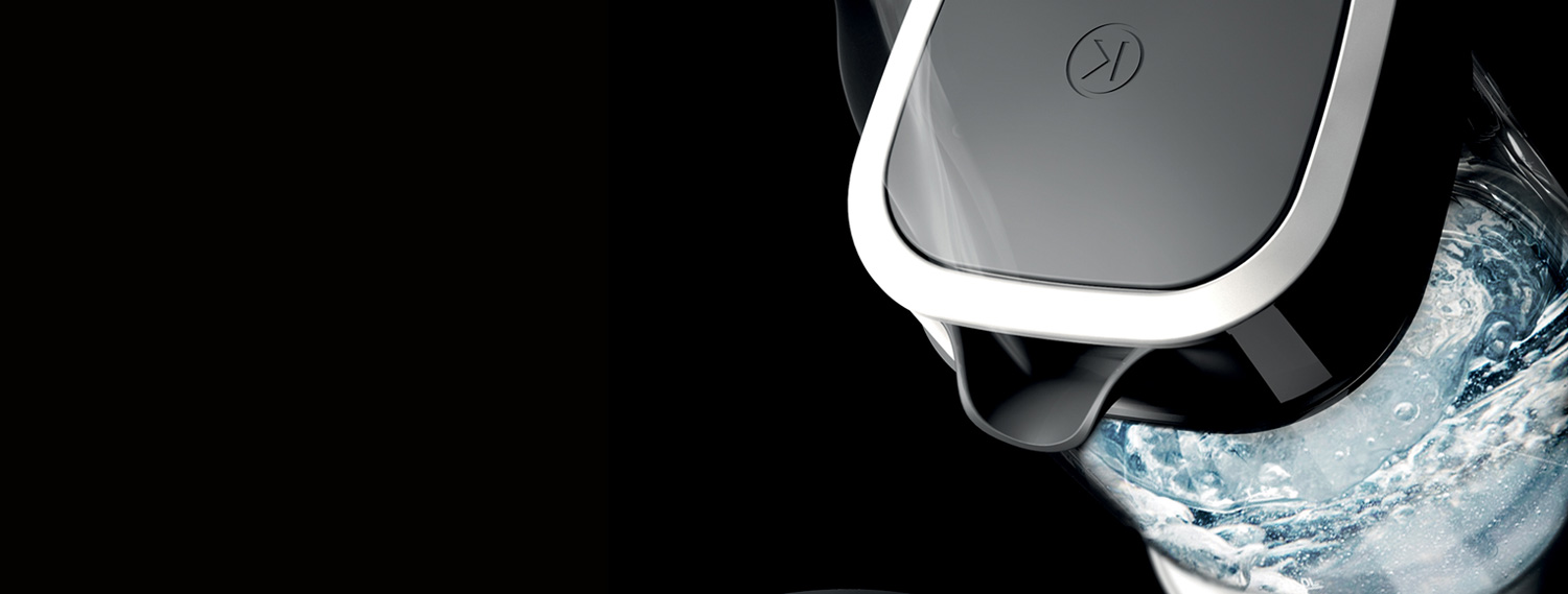
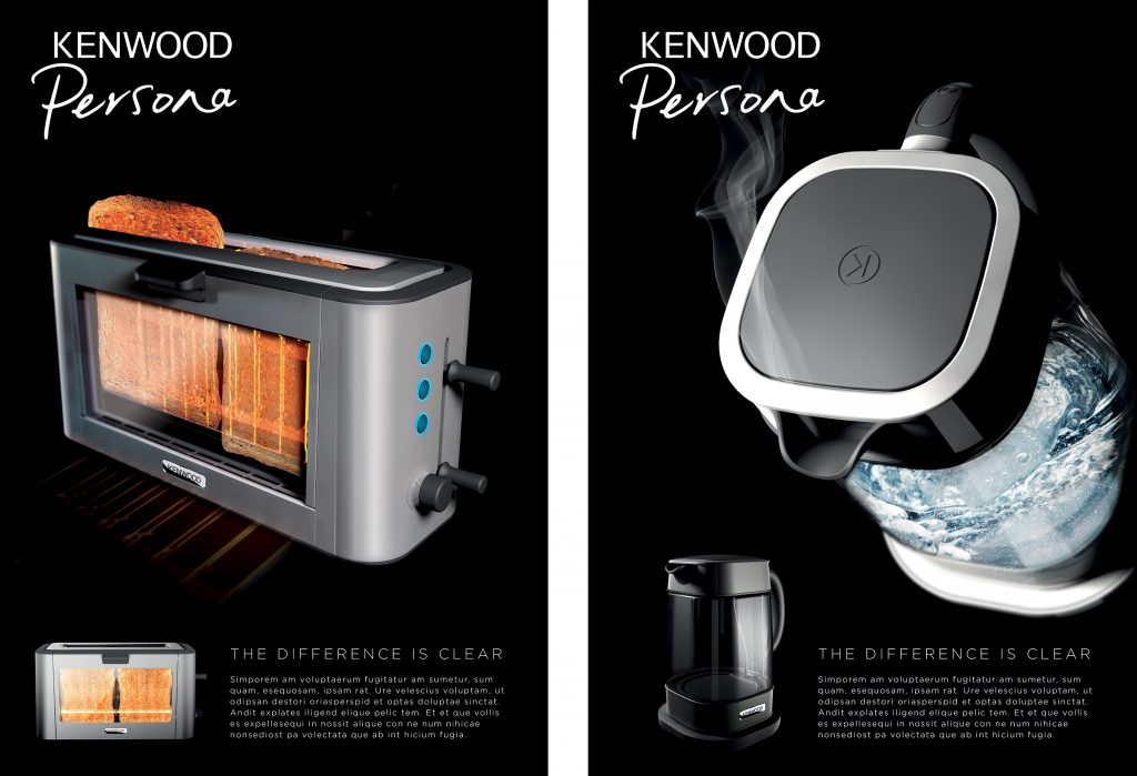
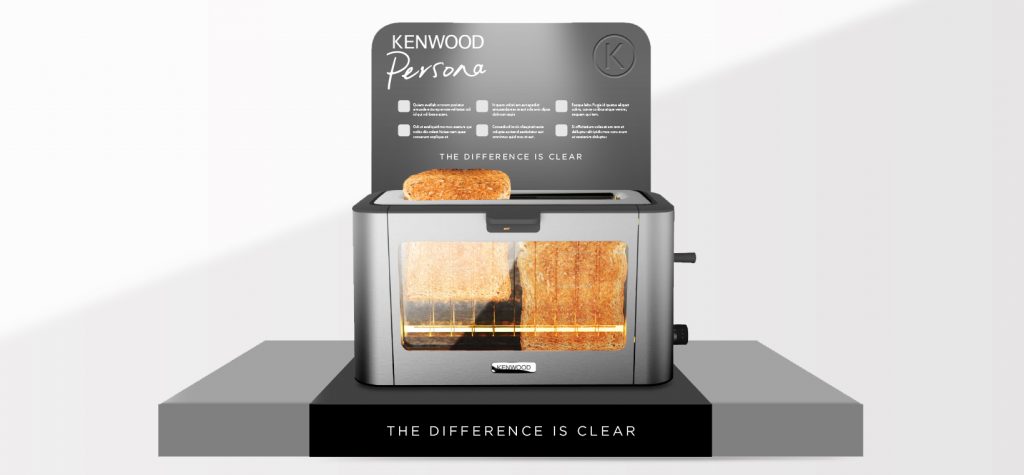
Throughout the entire process we wanted to highlight the amount of detail that went into the design of the range. This meant drawing attention to Kenwood’s use of premium materials, the unique shape of the kettle and placing emphasis on the benefits of being able to see the inner workings of the product as they happen. We approached this in a number of ways, including the use of 3D renders that allowed us visualise the products in a very stylised way. Using a render we were also able to highlight key features such as the highest quality Schott-Duran glass, giving consumers the opportunity to watch their water boil and toast brown with surprisingly mesmerising results.

Alongside this we created a product film, using CGI to exhibit the form of the products, and in particular the kettle, which takes on a unique square shaped body, set to become a signature style of design for all Kenwood kettles.

The film included an original soundtrack that amplified the sounds of the products and gave the film a contemporary edge. The strapline ‘The Difference is Clear’ worked to highlight the key product feature of the glass – as well as highlighting the difference between these higher end Kenwood products versus more ‘run of the mill cheaper alternatives. This would help further Kenwood’s position as both a designer and manufacturer of high-end appliances within the breakfast category.

Got a similar project? Speak to one of our experts today